
The Color Pink: Breaking My Own Rules of Making

Posing (in pink, of course) next to nine experiments with reflected pink color on stitched white felt, each measuring 8x8 inches and up to 3 inches deep.
In the spirit of ‘living in the now’ and giving myself more studio work time this year I’ve been indulging in ideas accumulating in my sketchbook, even when the sequence from one body of work to the next isn’t currently obvious. It’s all related by, well, me.
Following my ‘Objects of Intrigue’ brown and black wool drawings, I’ve jumped next to the concept of using smooth white wool felt sheets to reflect color. And not just any color: I’m using an insane fluorescent pink to color the backsides and edges of clean, minimalist stitched designs with the result of a subtle pink glow that changes with lighting conditions. I think of these pieces as quietly, delicately powerful; symbols of elegance and simple complexities that reveal themselves through attention and light. They’re available now in my online shop.
These may seem a bit like a departure from my needle felted forms, but they’re certainly from the same brain and hands. They come from a spirit of curiosity and experimentation, which I would consider the touchstone in my practice.
I learn from and respond to all sorts of sources when it comes to my artmaking, however when it comes to my particular materials and techniques of needle felting and stitched felt I find I’m somewhat of a pioneer. At the very least, I don’t have any clear predecessors or guides. That’s not a bad thing; it means I have to/get to do the work of trying things to see what happens. And like any true experiment, there aren’t necessarily successes or failures; instead each is a learning opportunity that may or may not have turned our how I expected (or hoped!). This one, for example, required a major re-do; I’ll show what I mean in a subsequent post.

‘Pinkness Study #5 (Circle Holes) went through a big re-do over the course of its creation. I’ll write more about that next time and link it here.
So I’m pretty comfortable trying new things. And yet over the years that I’ve been exploring this seemingly unexplored approach to materials and techniques I’ve nonetheless discovered that I hold some foregone ‘rules’ in my head about what is allowed or not allowed. Silly, I know, but something a lot of makers come up against with all sorts of different traditions of making. Some of those rules are quite useful and come from the best practices developed by others for safety, efficacy, and efficiency. Some of the origins of the rules are lost to time and may be vestiges of mere quirks of their originator. And even when one is working within a tradition it’s good to push against and question the rules to develop one’s own voice. But I had thought that since there were no official rules I could find, particularly with needle felting, I was free to do whatever I wanted.
But I occasionally acknowledge the ways I DO have rules, some related to other art realms I’ve worked in (stone carving, metalsmithing, working in clay to name a few) and some that I developed in response to felt. The first was an early one— I realized I put a lot of stock in my felt sculptures being NOTHING but felt, through and through, without any support or armature. The novelty of being able to say that a freestanding form was made solely of compressed fibers certainly had a ‘wow’ factor. But what did that get me? Only a limitation on developing forms that needed a little extra help or working a LOT larger. So I tossed that rule aside. This ‘Overbreeding’ sculpture wouldn’t have been possible otherwise:
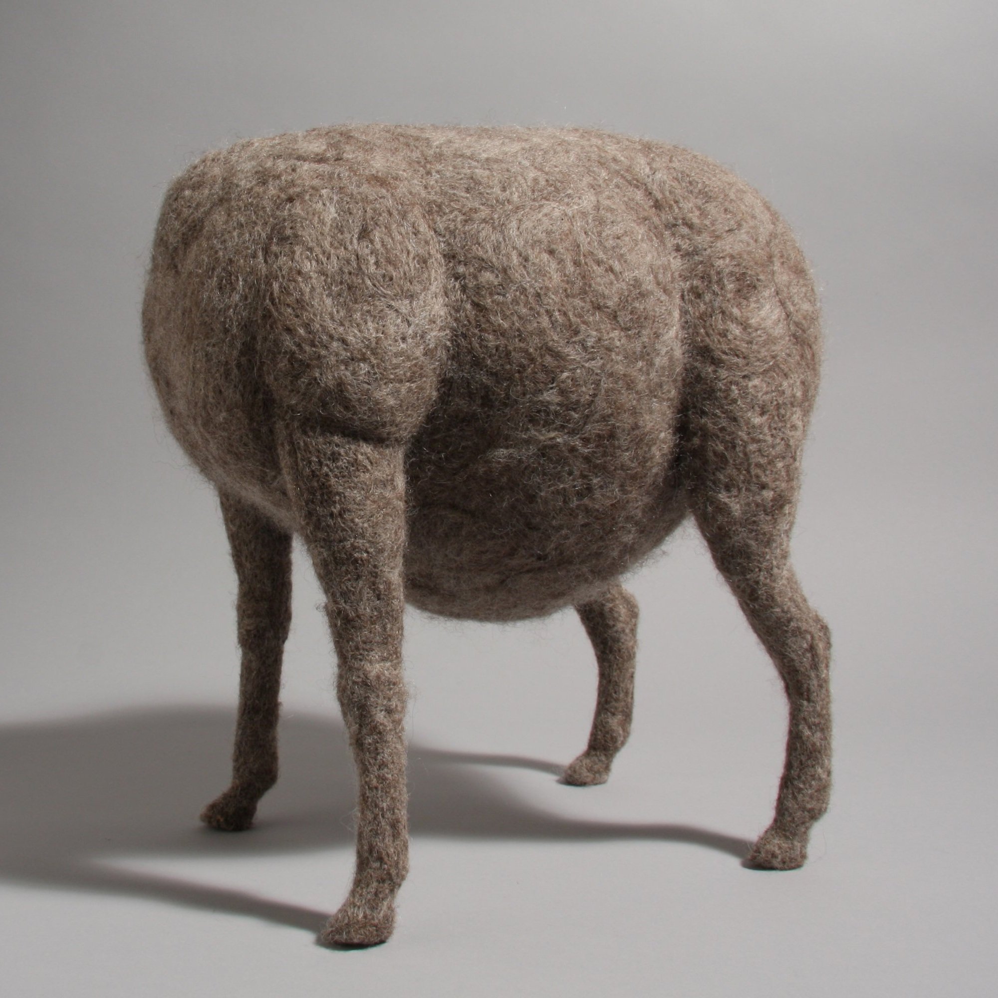
This sculpture was one of the first to have a simple wire armature; I had to insert wires into the legs despite my attempts to make them so dense that they could hold up the rounded body on their own. They couldn’t. But it led me to innovate and find that I could insert wires AFTER nearly completing the piece, instead of at the beginning.
How do my rules figure into these pink studies? Well, for starters with my using color at all. I truly love the creamy white or warm, mixed browns of natural wool; love that it references its source as an organic material that’s only been minimally processed (cleaned, for God’s sake, cleaned/degreased, brushed!!!).
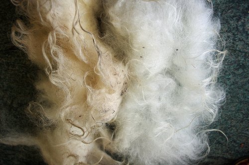
Clean vs dirty wool from an article on whether or not to wash it. I say yes.
White forms are very much about form, light, and shadow. The decision to introduce color is not something I undertake lightly; there has to be a good reason for it.
Pink is a color pushed on girls from birth, at least in the U.S. It’s very gendered, and the associations that ride along with it are messages of softness, delicacy, fragility, innocence. I never fit into that picture of girlhood, and rejected it from a young age. In toy stores I recall being strongly turned off by the ‘pink’ aisle where Barbie dolls and all their accouterments are packaged in a particular bright fuchsia. Just do an internet image search for ‘Barbie Aisle’ and you’ll see for yourself.
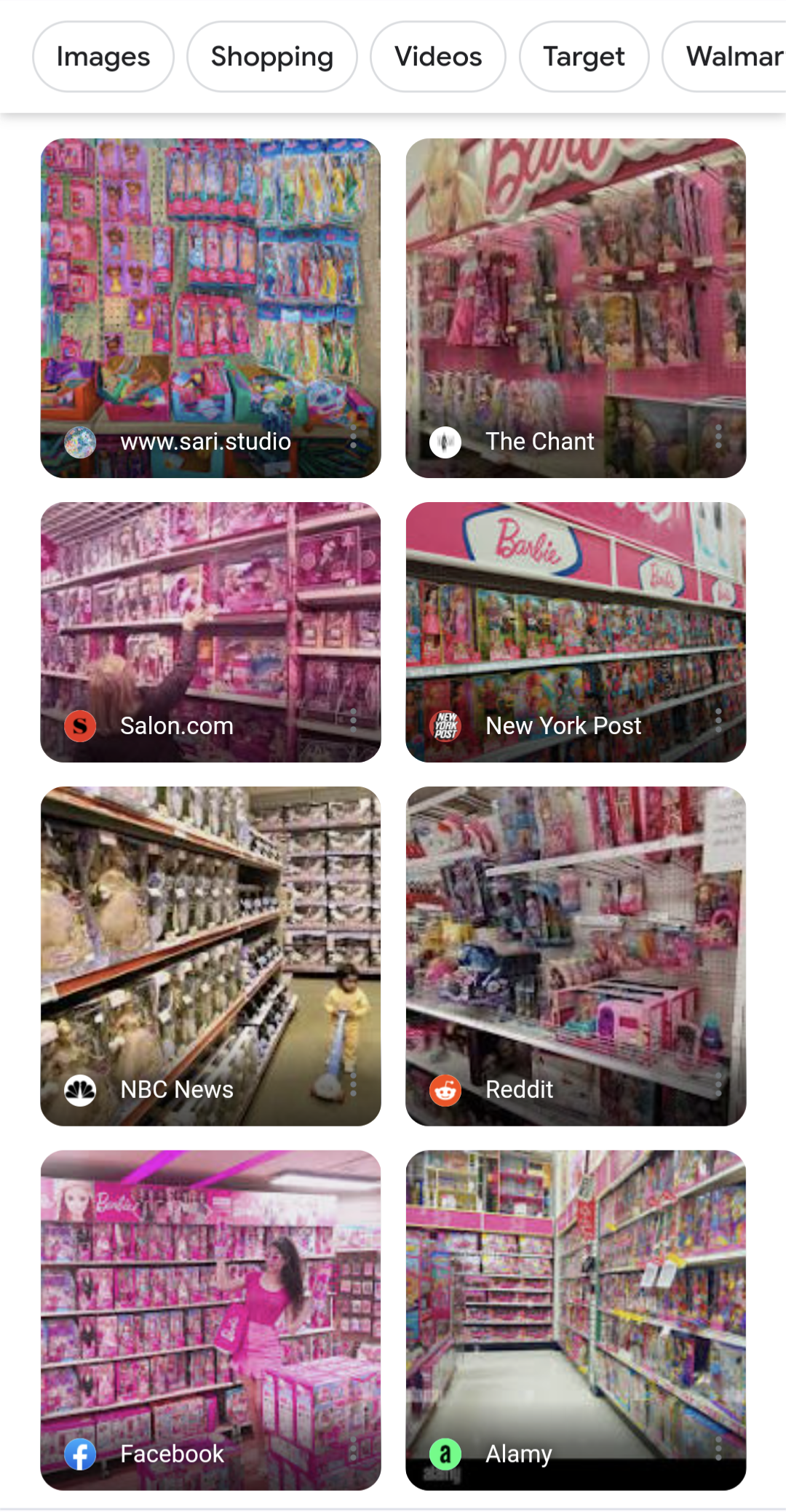
A Google search for ‘Barbie Aisle’ shows toy store sections with products targeted at girls.
Then there are the Victoria’s Secret clothes and intimates emblazoned with the word 'pink,’ which I long thought of simply as their way of trying to co-opt the color for their brand. Then a male friend revealed to me that ‘pink’ is also slang for lady parts in a lot of cultures, and now I can’t get that out of my head when I see a pre-teen with ‘PINK’ across her rear. The color is sexualized AND gendered.
‘Pink’ can also refer to the body in terms of more, ahem, internal parts— organs and tissues. Depending on context and shape, it can suggest a feeling of squeamishness or rawness. Yet pink is also officially a color of love and romance. Lots of intriguingly opposing and loaded meanings to mine with this one.
I know, maybe that’s making too much of it, and a color is just a color. It IS, of course, just a color. But meaning is something everyone reads into, one way or another, based on one’s own lived experiences. Heck, ever heard of ‘rose-colored glasses?’

Yes, this is a hole cut and stitched into a wool panel, with slight pink color coming from reflections of the bright pink color applied to the back side.
So. I’m fully embracing that my use of the color pink will be interpreted in myriad ways, especially given that I tend to take forms from organic sources of bodies, undersea creatures and plant life to name a few. Heck, what I thought of as a simple first foray into seeing how reflected pink through an opening in a sculptural surface might change the color of the wall behind the art yielded a lot of comments about how sexual my work is. Here’s a video, if you want to see me show the backside (and read some comments; I do in fact delete the overly foul and crass ones when I catch them from what is MY posting, after all).
Internet trolls aside, I am finally in a place (thank you, 40’s) to not care so much what people read into the things I create ESPECIALLY when it comes to suggestions of a sexual nature, which is a triumph considering that I grew up in an atmosphere of Catholic guilt and discomfort around all things sex-related. What you see is partly on me, partly on you, for good or bad or however you interpret it. Neither of us lives in a vacuum. If my color choice layered with my chosen forms makes you think of sex, so be it.
But I digressed a bit. Here’s the other thing about me and rules: I broke another one I didn’t now I had, and it’s related to the color. I USED SPRAY PAINT. There. I admit that I used chemically, fakey, totally un-organic fluorescent pink spray paint to achieve the overly bright pink color I deemed necessary to get the reflected color I wanted. It went against my instincts as far as materials go; I love that most of the things I work with are tactile and, well, wholesome and satisfying in a way that spray paint… really isn’t. But as an artist I’m also a problem-solver, and using a layer of super-intense color over flat pieces of felt seemed like the best way to achieve the effect I wanted in this vein.
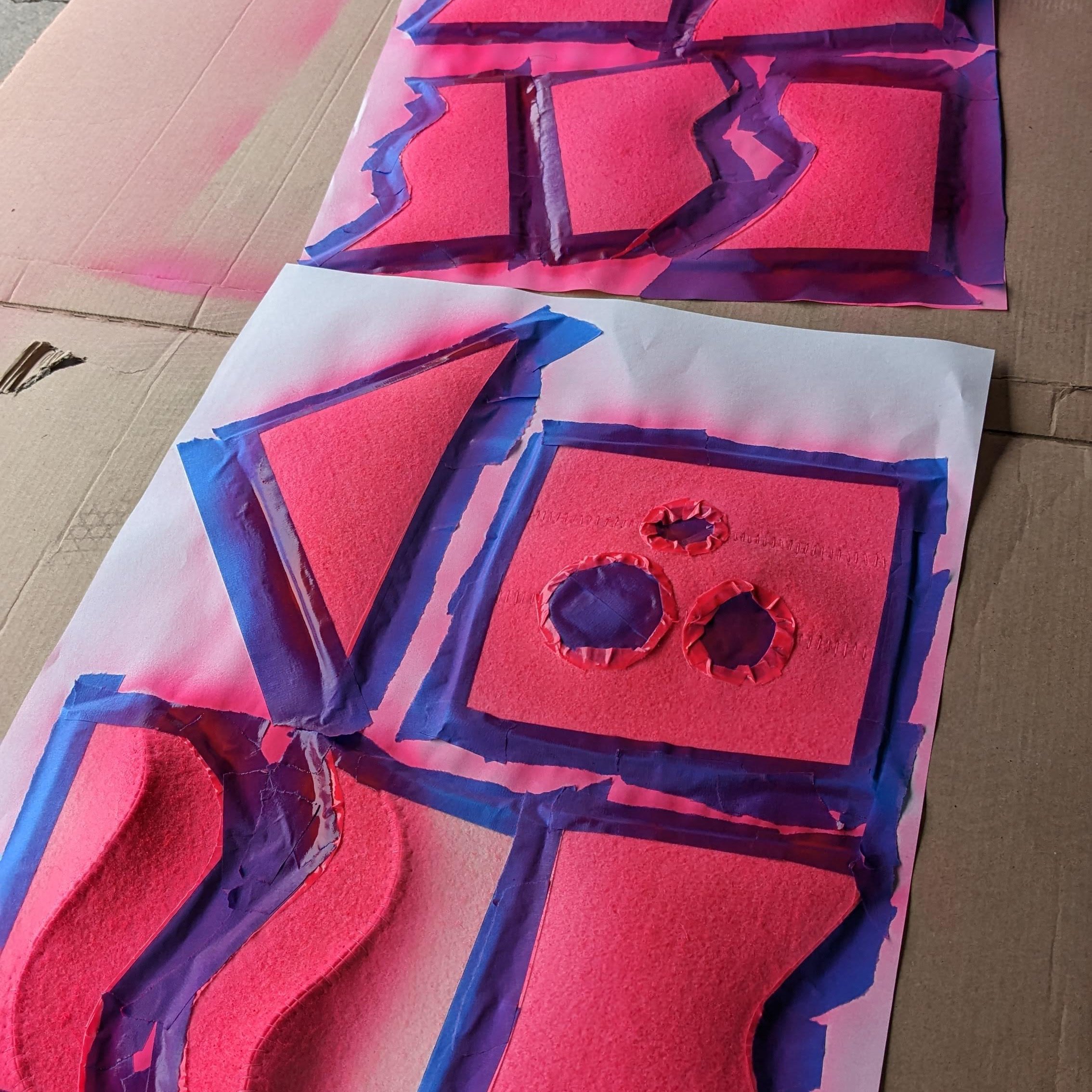
The back side of component parts of various ‘Pinkness Study’ sculptures as they receive their coating of fluorescent spray paint.
And I have to say I’m glad I did. Despite the off-putting crunchy coated texture (which really doesn’t affect the experience of the work as a whole, just the experience of its creation), the sprayed pink worked out as I hoped. Figuring out the optics of capturing light through the sculpted shape to better reflect the color has been another whole issue. I’ll share some stories from that in the future.
So, there you have it. Breaking the rules (even if you’re the one who made them) can be a really good way to stretch creatively. I’m curious to see what this experiment will lead to in my practice. I may have purchased some neon pink dyed wool to play with…shhhh.
Finally, the visual effect of these sculptures varies greatly depending on the lighting situation. Below are four slightly different situations, but you can also view some videos that show how the works change depending on their surroundings: here’s one with the drama of direct sunshine, and here’s one cycling through lighting conditions as I photographed them in my hallway with only skylights, hallway lights, and an LED light in different combinations.
If you’ve got to have one, available Pinkness Studies are available in my online shop.

Different combinations of light yield different effects, both in how saturated the pink color is, and the sculptural look of the pieces.
I think of experimenting as playing with an extra dose of attention. Now, back to the studio…