
Feeling The Glow of a New Project
I’m preparing new work for a solo exhibition slated for September- December 2024 at the Triton Museum in Santa Clara. Here’s your sneak peek at my plans.
The Triton Museum of Art is a city-run facility that exhibits contemporary and historical works with an emphasis on artists of the Greater Bay Area. The curator who approached me has been extremely supportive of my desire to create a new body of of work for the gorgeous gallery, including a site-specific installation piece.
This is, in fact, one of my career goals: to have carte blanche and a ready space to explore my ideas three-dimensionally. I could have suggested a retrospective, but can you blame me for jumping at this opportunity? Plus, a deadline (and a venue) help me make the most of my creative time on this earth.
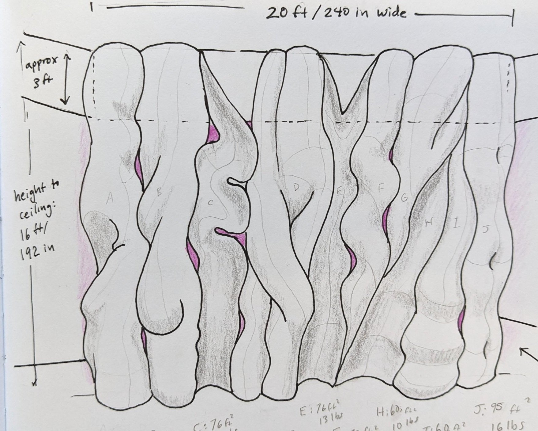
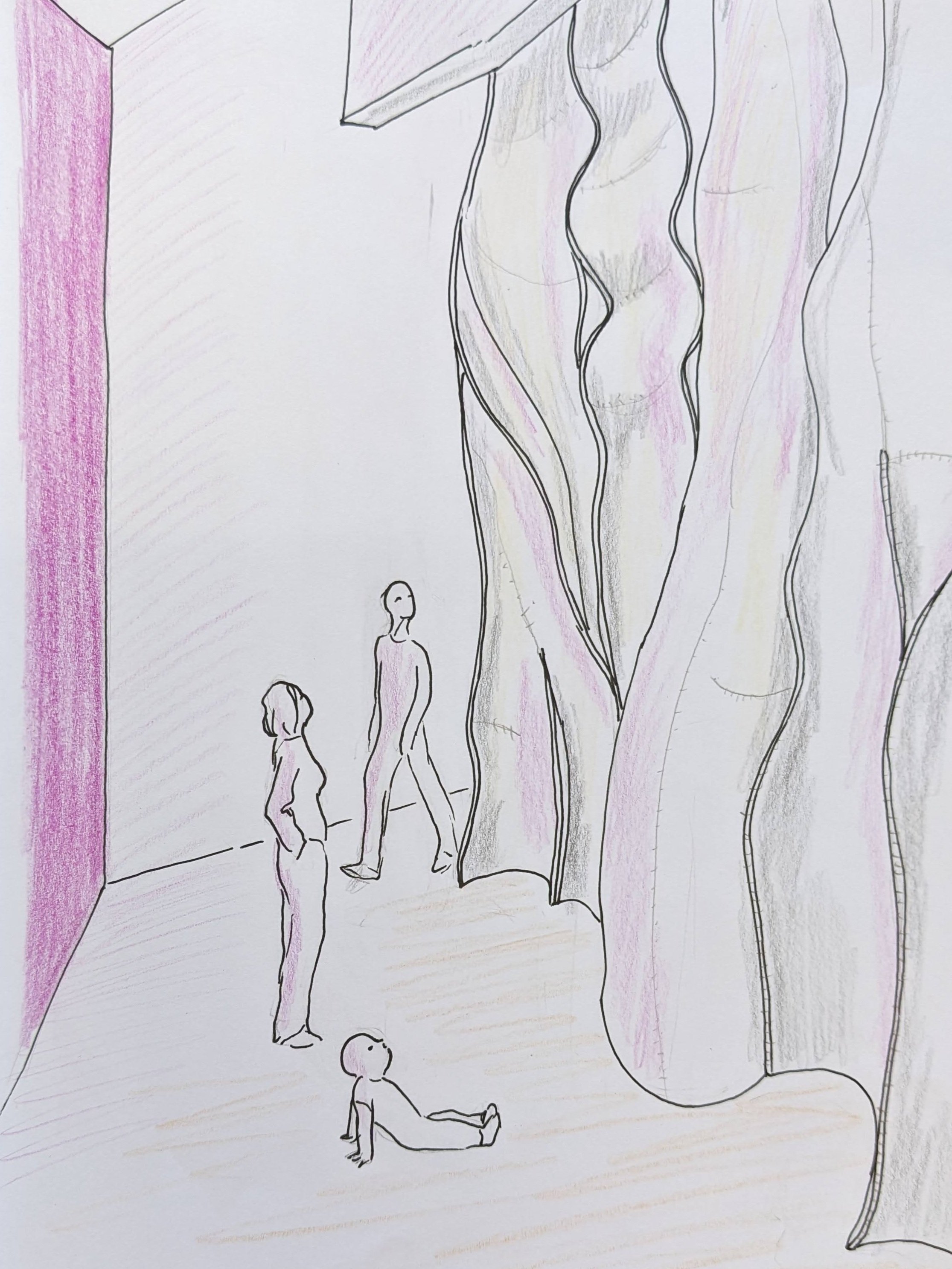
So what am I planning to include in this exhibition? It will be a mix of four or five freestanding sculptures (sized to be presented on pedestals), a similar number of wall-mounted stitched sculptures, and a large stitched sculptural piece that will hang from a ceiling feature. And one of the aspects that will unite this body of work (besides my abstracted organic forms)? The color pink. Crazy intense pink softened when reflected against white wool or felt, bounced off of undersides or insides or, in the case of the 16-foot-tall installation, the huge wall behind it.
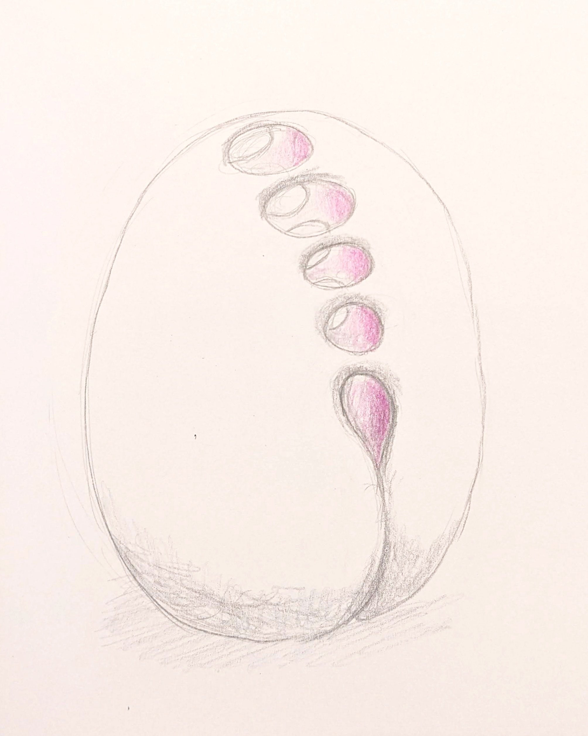
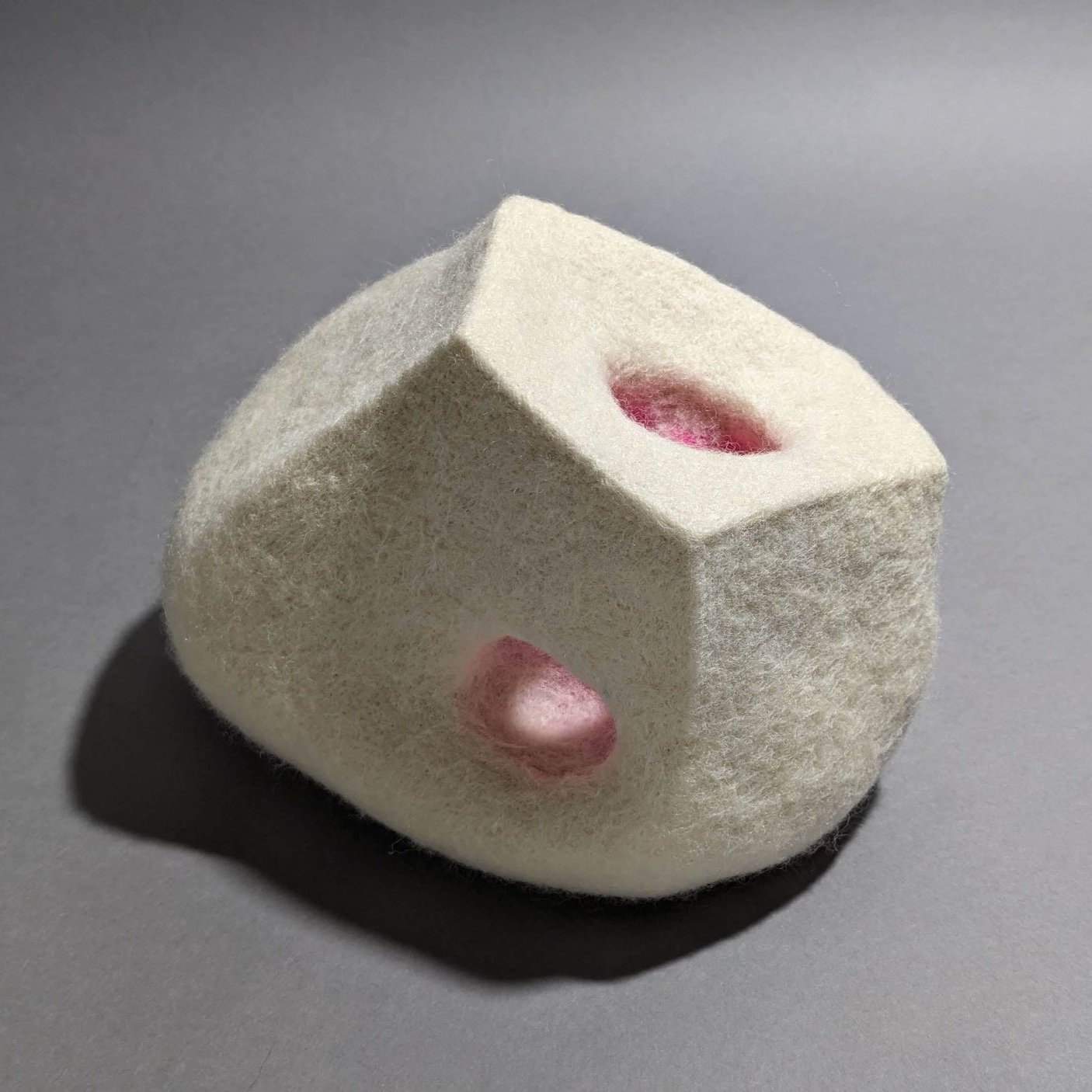
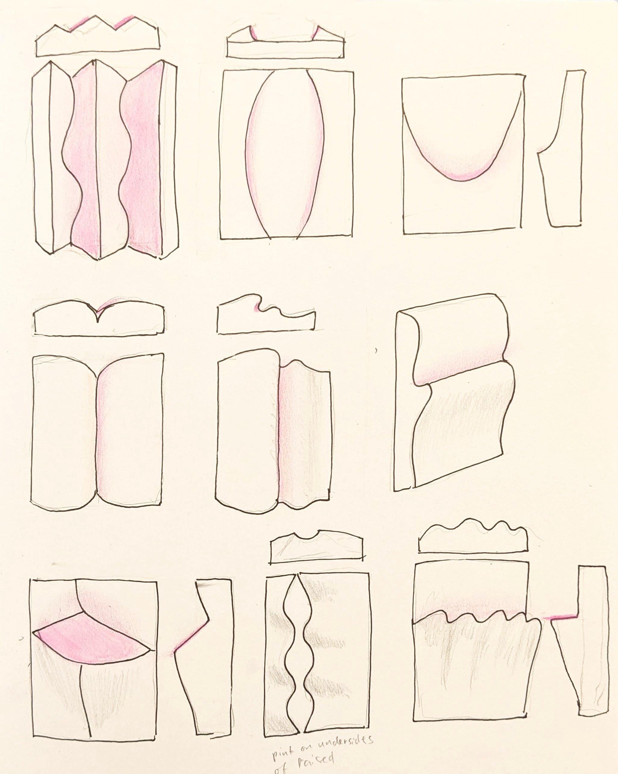
These are initial sketches of some of the freestanding sculptures; note the plans for bright pink insides.
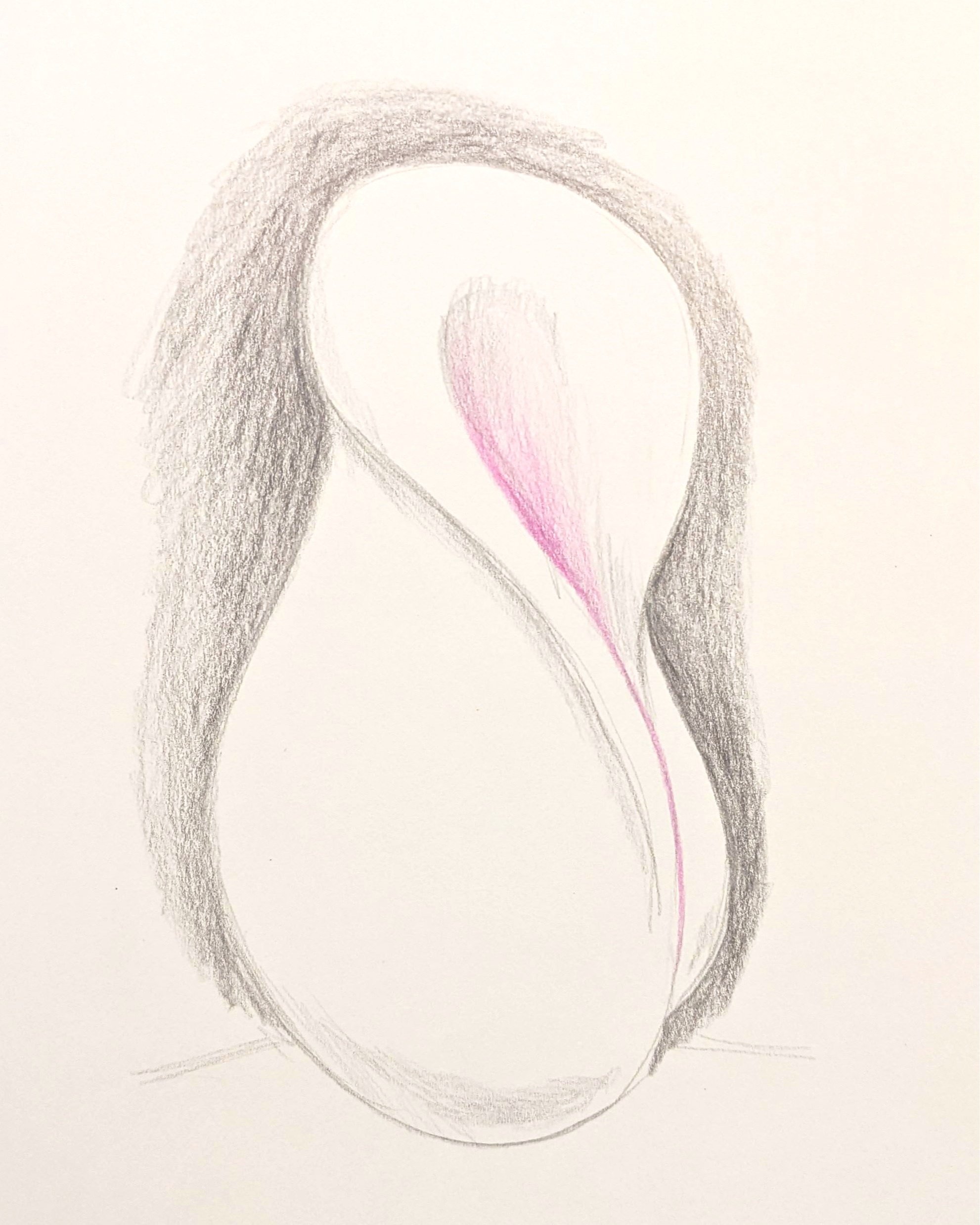
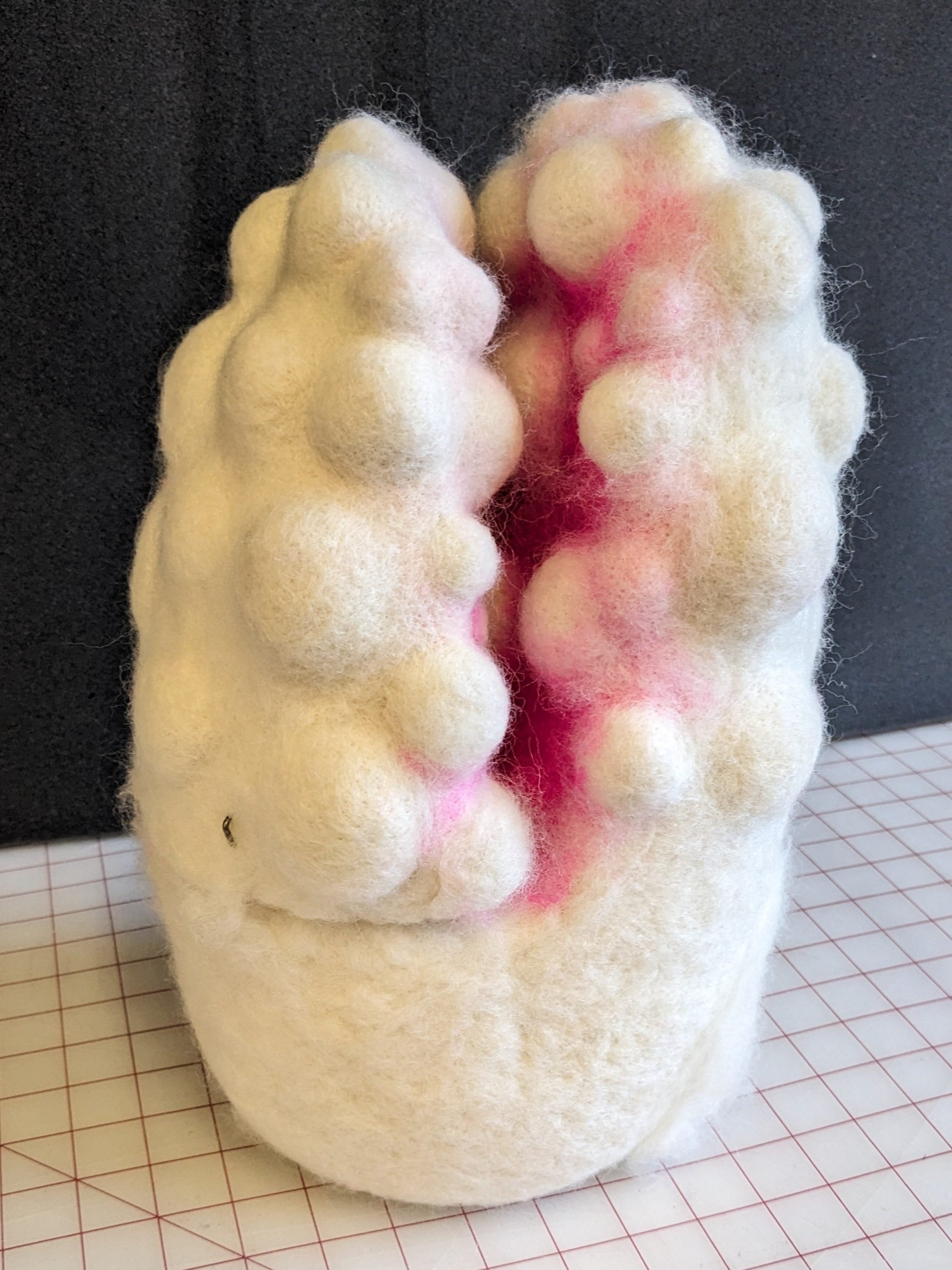
This one is still in progress, here is the sketch followed the almost-finished piece:

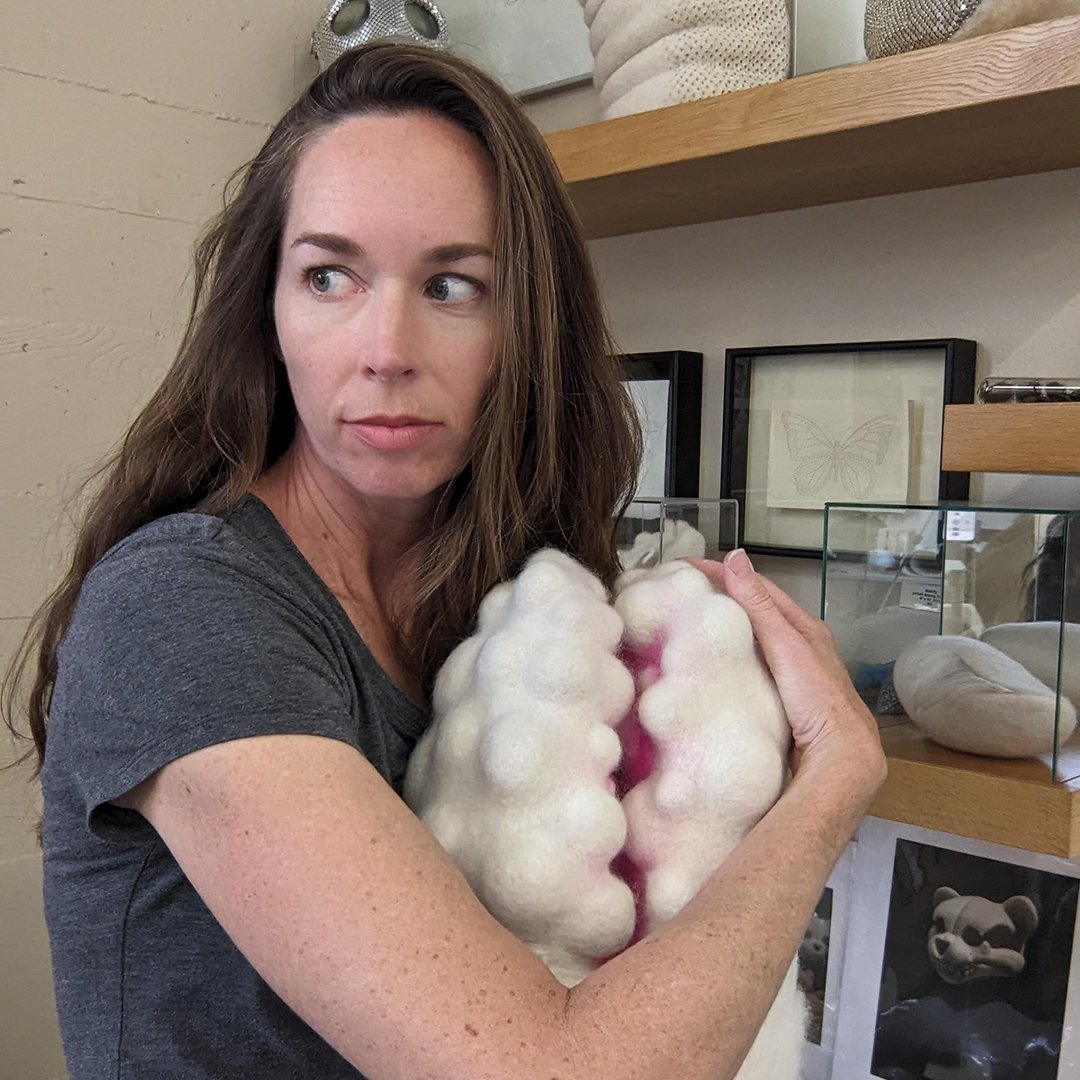
This one is already completed; note the glowing pink effect as light passes through the pink-lined tunnel.
These are sketches for stitched wall-mounted pieces, larger and more complex versions of the pink panel studies I’ve made. Before I used fluorescent pink spray paint; this time I may use dyed fiber. Yes, you can achieve that color with dye.
And the installation piece: the plan is that it will be suspended ten feet from the back wall (the gallery space is a long octagon) and the wall behind it will be painted with a particular intense shade of pink, which will reflect off the back of the white felt. You can go around and behind it to feel like you’re really getting INSIDE the sculpture.
“Why?” you might ask. “What is the deal with this pink?!”
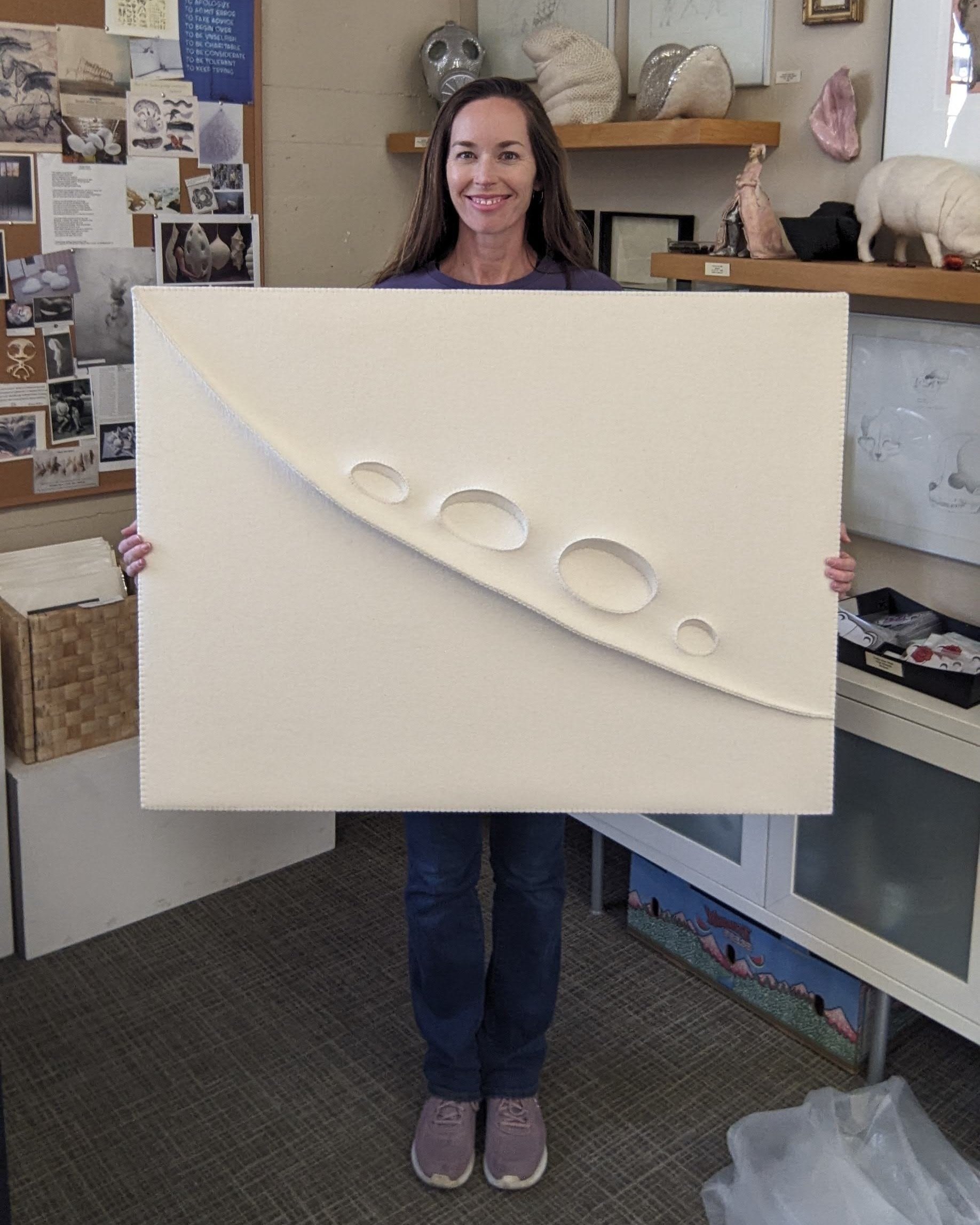
If you’ve been following along with what’s piqued my interest over the last few years, you’ll know that I have been exploring form and (gasp!) color in new ways. Besides needle-felting wool into sculptural forms, I’ve been turned on to using flat (but thick) sheets of industrial felt to see how I can manipulate them into elegant topography. Here’s one example, called ‘Crest + Fossa’:
I’ve also gone from using mainly the natural colors of sheeps’ wool— white/cream, grey, and brown— to playing with what may well be the opposite end of the spectrum: that aforementioned fluorescent pink.

You can also find THAT color in nature if you’re looking in the ocean or simply walking through my neighborhood. My use of it— or rather, the reflected color haze that can bounce off it onto white felt— has five components:
1) Over a lifetime of looking closely at things, I continue to be fascinated by the way we see at all, thanks in most part to the quality, intensity, and directionality of light. When it comes to color there’s even more to pay attention to. I’m thinking about looking and perception. I’m interested in noticing what I am noticing. And related to that…
2) Bouncing color so you’re seeing the reflected color is a way to subtly guide attention to the fact that, in art, we’re seeing something contrived and created by a fellow human being. I like inserting that back into the conversation between viewer and art. To paraphrase Lawrence Weschler in his writing about the artist Robert Irwin,
“Aesthetic perception itself is the pure subject of art. Art exists not in objects but in a way of seeing.”
3) Color is tricky and loaded and personal. I have a close relative who doesn’t see color like the majority of the population, which makes me extra cognizant of the subjective nature of color itself, even before reading meaning into it.
4) The color pink is so very universal among animals: it’s inside all of us, in our literal guts, regardless of our outward appearance. As a color it seems vital, vulnerable, raw, and comforting all at once.
5) And finally, my use of the color pink is also a reexamination of how much I have in the past rejected and discarded the color purely because of its historical link to girlhood and femininity. Growing up I never identified as a ‘girly’ girl- I preferred dirt, making, and adventure- so I felt quite uncomfortable with the social strictures on how girls and young ladies and women ‘should’ be. I gave it a lot of power, but in a negative way. It’s time for another look.
My sculptural forms- freestanding, wall pieces, and the big hanging stitched piece- will in some way bear the muscular, organic, mysterious features that continue to engage me. Folds of flesh, sinuous curves, and weighty, solid masses blended with delicate and precise details are a way for me to explore the contradictions and variations that ground us in our physical bodies. In a time that feels ever more dismissive of respect for corporeal beings, especially when they are somehow framed as “the other,” I find myself increasingly insistent on the tactile, tangible, physical stand-in for others.
And that brings me back again to the color pink: the life force, the glow. In fact the working title of this show and body of work is ‘In The Glow’. The glowing pink insistent color that, I hope, will at the very least cause viewers to pause.
And now I hope you’ll forgive the limitations of the written word when it comes to experiencing sculpture. Here I’m trying to use words to communicate to you what I hope to work out with my sculptural forms, but I hope you’ll ‘read’ them directly, in person or through images, to find out what, if anything, they might evoke in you.
Stay tuned for more on the making of these .